Archive for the ‘Random Art Bloggery’ Category

The Olympics Opening Ceremonies Live.

Monday, July 26th, 2021

They’re still calling it Tokyo 2020. I guess they had everything designed and didn’t want to change it.

The 5,000 medals are made completely from e-waste. The Japanese donated all their electronic crap and factories spent hours and hours extracting the precious metals. I think that’s cool.

Hey Steve Kornacki! Kornacki’s Khakis back in effect! You give me those stats I neither needed or wanted, Steve! Glad to hear ’em!

Okay, official opening ceremony has started. There is no audience in the stadium. It gives it a kind of gravitas.

Wait a minute, the Emperor of Japan is wearing a boring West-style suit? Dude, he’s the Emperor. I would wear the fanciest robes and accoutrement I have in my vault. Lord knows one doesn’t get too many opportunities to rock your finest Appointed-by-God attire.

Beautiful opening video.

They have an enormous Mt. Fugi with an orb on top to represent the true name of Japan, Land of the Rising Sun.
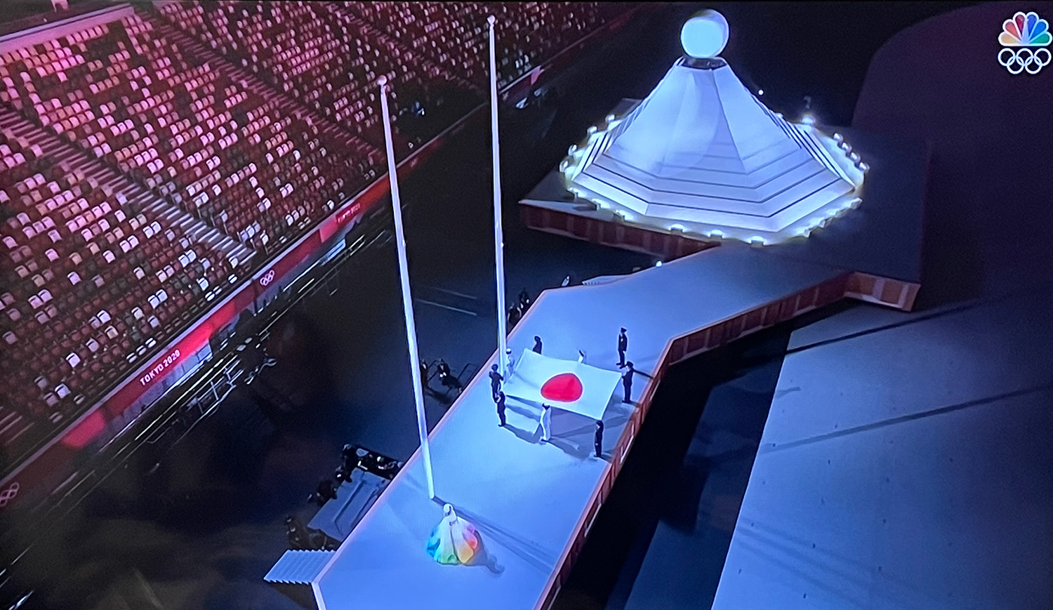
The flag also represents Land of the Rising Sun. Which is why I think this design for the Tokyo Olympics is better than the one they chose.

They’re using a lot of light painting on the floor and it is gorgeous. One of my favorite examples of that is this Kylie Minogue video.

Oooo, they got real weird and performance-arty with this. I feel like this MoMA thing is going to go over the head of… most of everyone in the world. Don’t get me wrong, it’s gorgeous but it’s a bit more Twyla Tharp-y then I think this audience can handle.

Didn’t think during the portion on the rich history of Japanese carpentry there would be tap-dancing but okay. It definitely conveys wood is hard.

Oh hell yeah, the lesbian goth hand-voguing girls Ayabambi are there! Bold move!

Okay, they’re making up countries at this point. Comoros? And every island in the Caribbean is its own country? My U.S. public school education is showing.

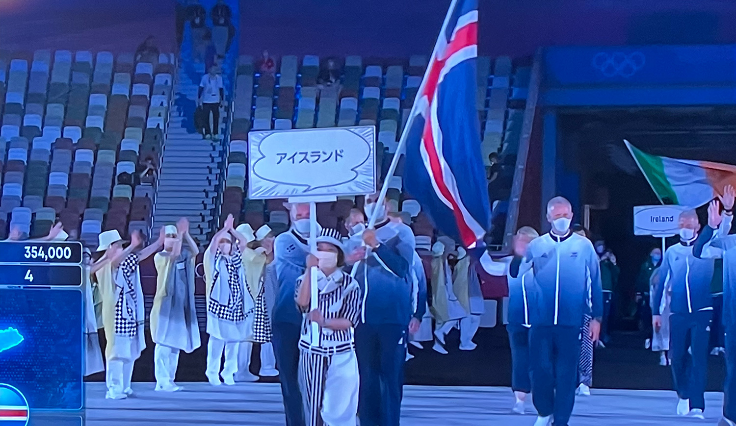
The people walking the teams in and cheering on the sides represent manga comics. I love how each country’s sign is in the manga screaming talk bubble. When the characters speak normally, it’s plain round speech bubbles.
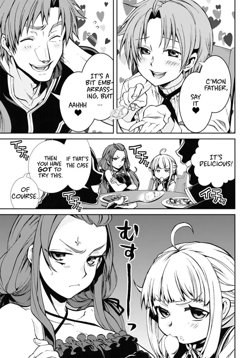
But when the characters scream, there are lines like rays of light shooting outward.

Due to that, I read every country’s name as a shrieking harpy.

All the countries are in. And now they’re doing some horribly awkward thing in bad wigs with colored boxes to show unity and I’m out. Nighty-night everyone.


P.S. Immediately after I turned off the TV there was some awesome stuff with 1800 drones. But there was a epically cringe-y version of “Imagine” that rotted my teeth so I ain’t sad about that.

Here’s the drone portion.

Museums.

Wednesday, July 21st, 2021

I visited San Francisco before The Pannie and I was delighted to find out there was an exhibition on Burning Man which, while fantastic, was problematic because now I am so hungry to go back. If one remembers I went in 2012 and while the dust and sun made me wanna DIIIIIEE the art was so unbelievable I would forget the horrors of nature for hours at a time. And the exhibit reminded me of that.

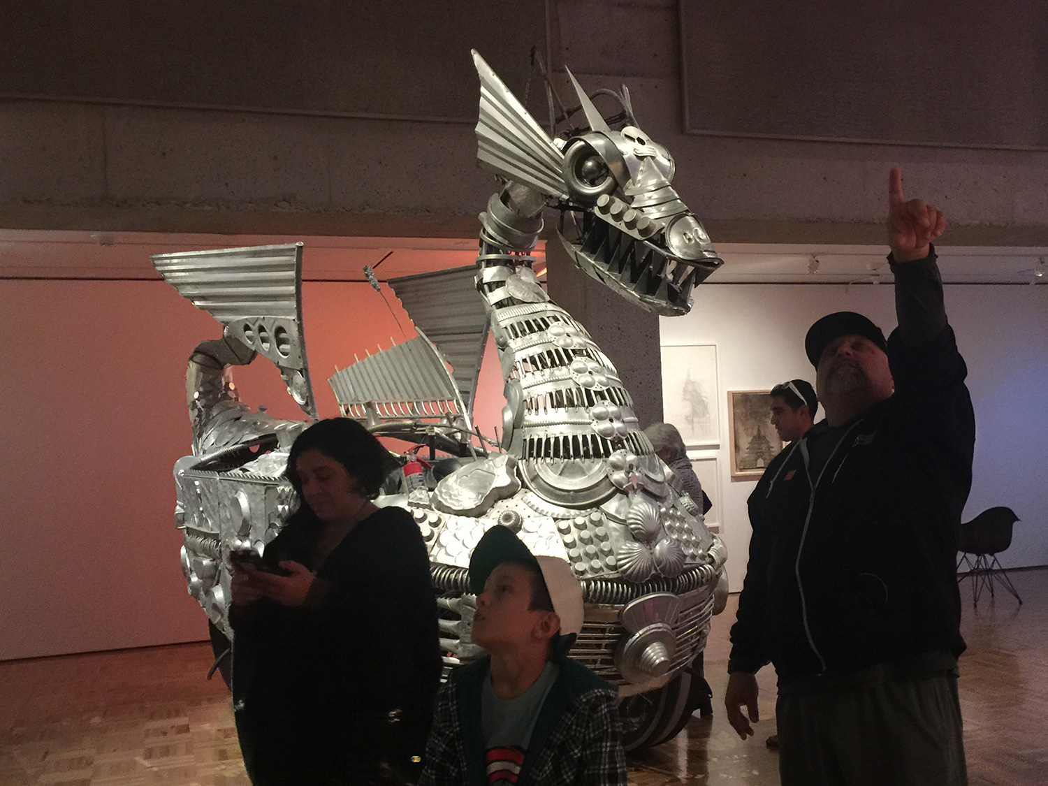
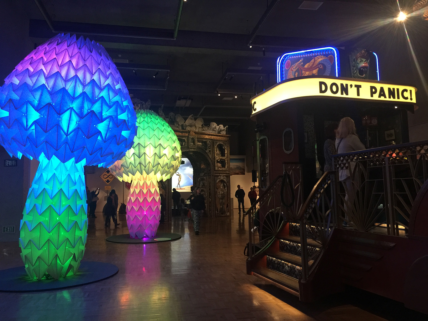
The left had an art car of a dragon made entirely from kitchen supplies, a bus that had been transformed into a movie theater that showed old black-and-white movies and origami-style mushrooms that cycled through the rainbow and extended / contracted when you pressed a button. Oh my God, guys.

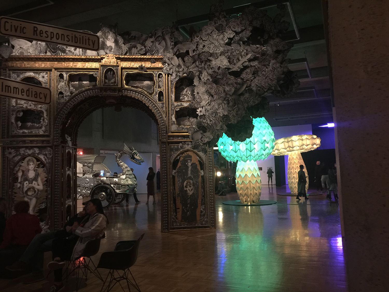
There was also an enormous Arc du Triomphe-style collapsable arc. You can appreciate the color-changing mushrooms in the background.

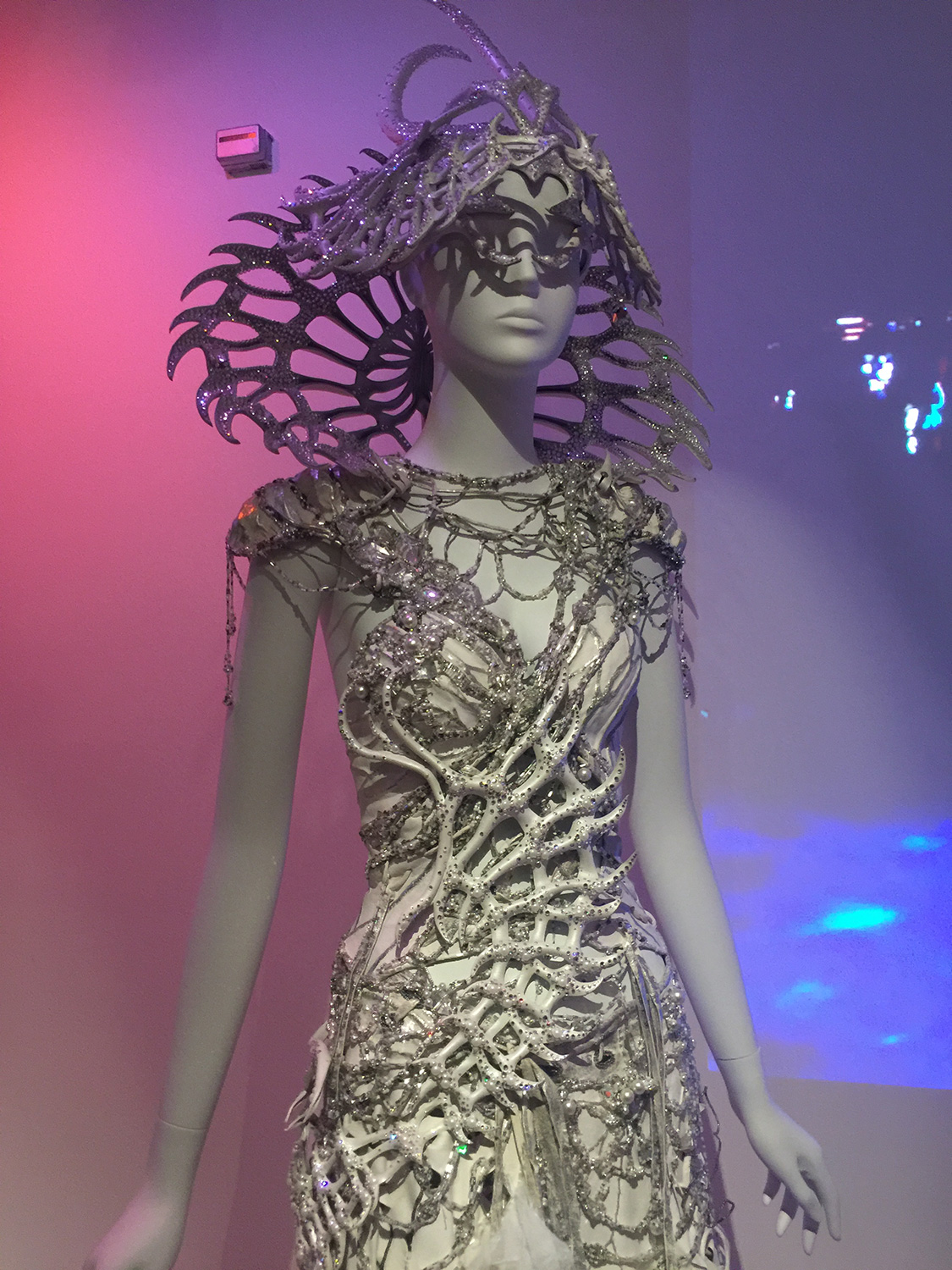
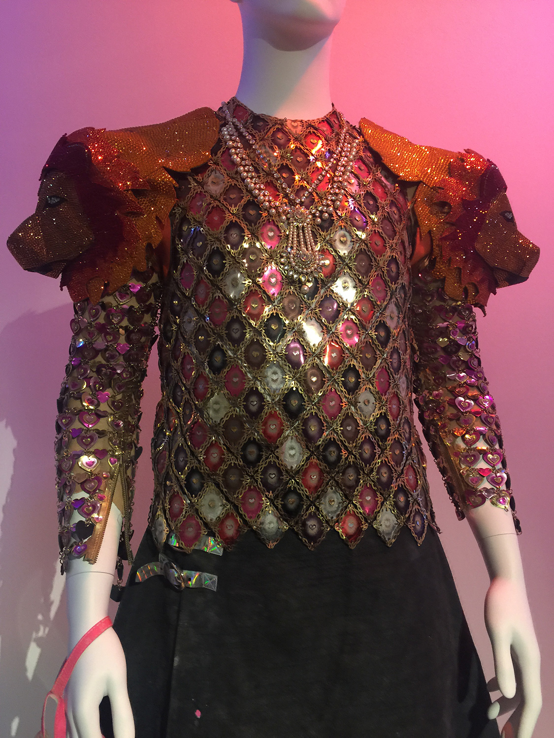
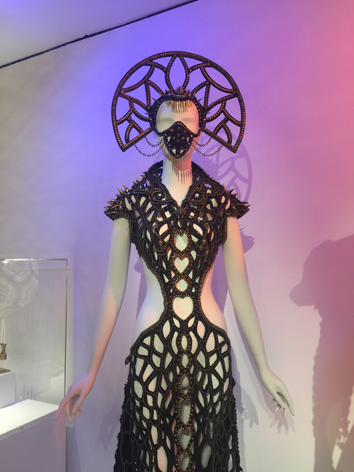
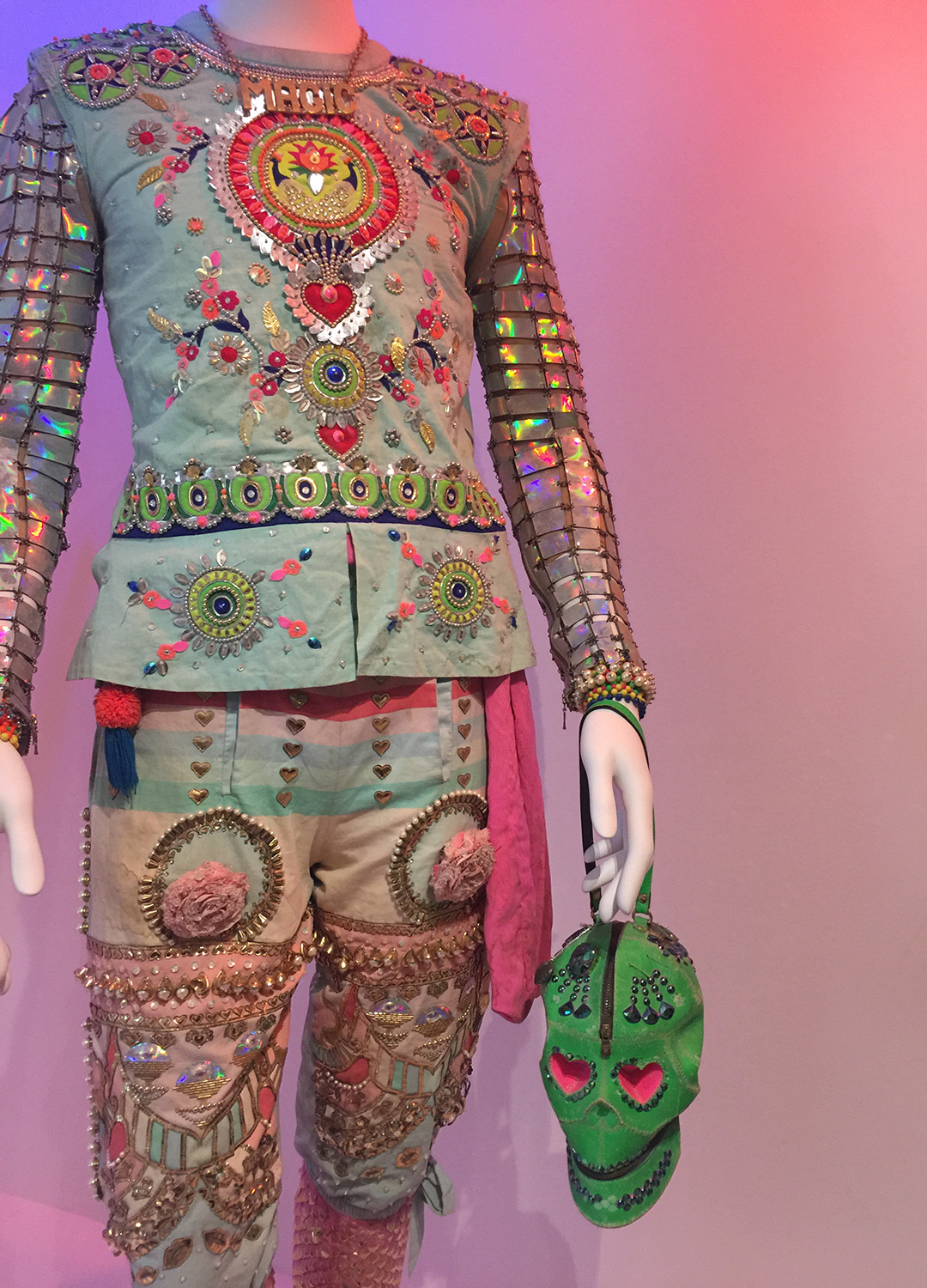
There also had some outfits on display which was fine, not as exciting as the large pieces but still, stunning workmanship.

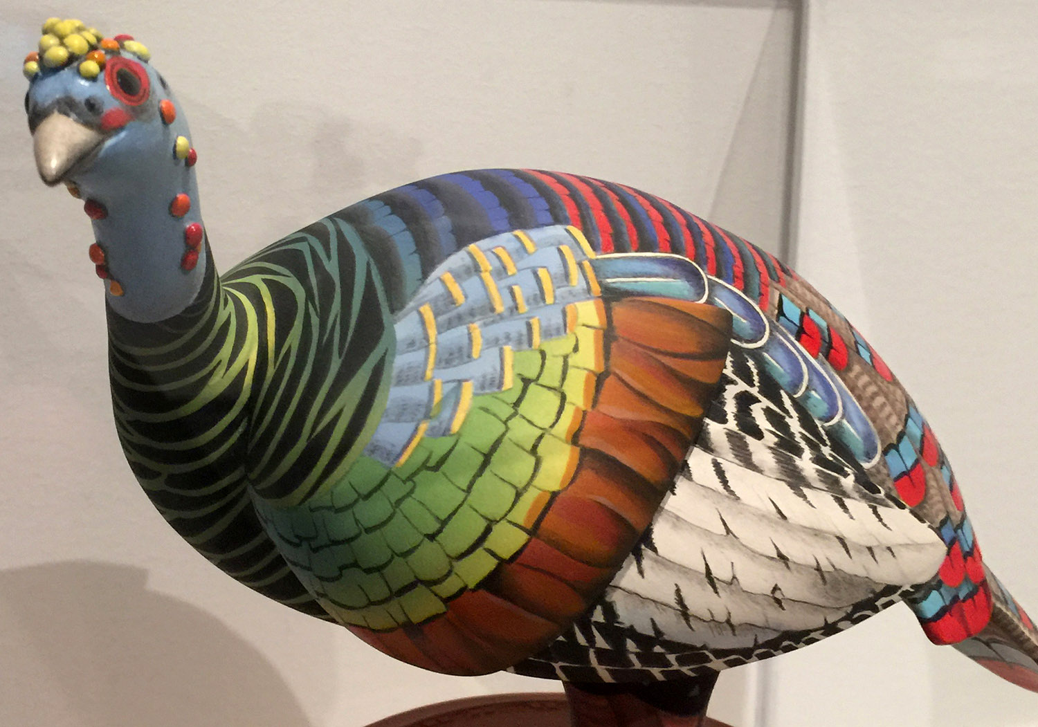
I was there with Nessa and we ended up walking through the rest of the museum and I saw my dream piece. I’ve made it abundantly clear my feelings on ocellated turkeys (I’m pro in a big way) so off in the distance I thought I saw something truly magical. And I was right.

It was made of clay and I wanted in my possession immediately. It’s good it was in a glass case because I would have tucked it under my shirt and bolted with it.

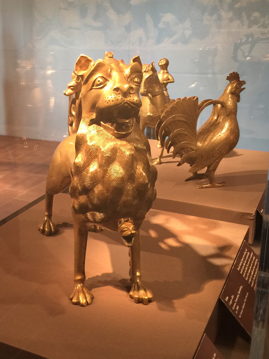
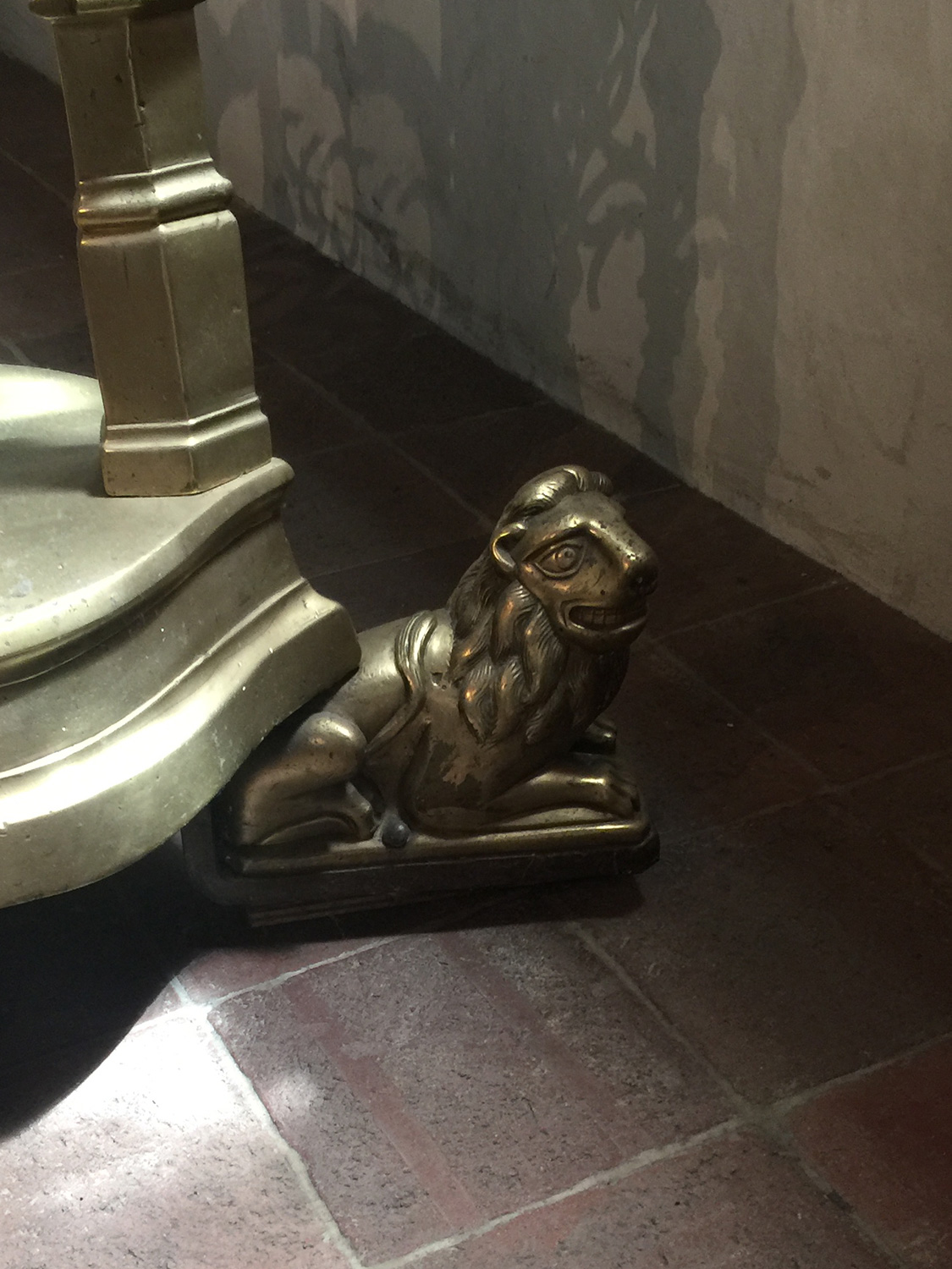
I recently went to the Cloisters, a museum in New York specializing in the Middle and Dark Ages of Europe. It was painfully obvious that no one had ever seen a lion, heard of a lion except in the bible and didn’t even know lions were felines. It was rough.

Not a decent one in the bunch. You clearly had skills, look at that golden rooster. Totally looks like a rooster. Europe had wolves, why didn’t you carve wolves? Your lions are so bad.

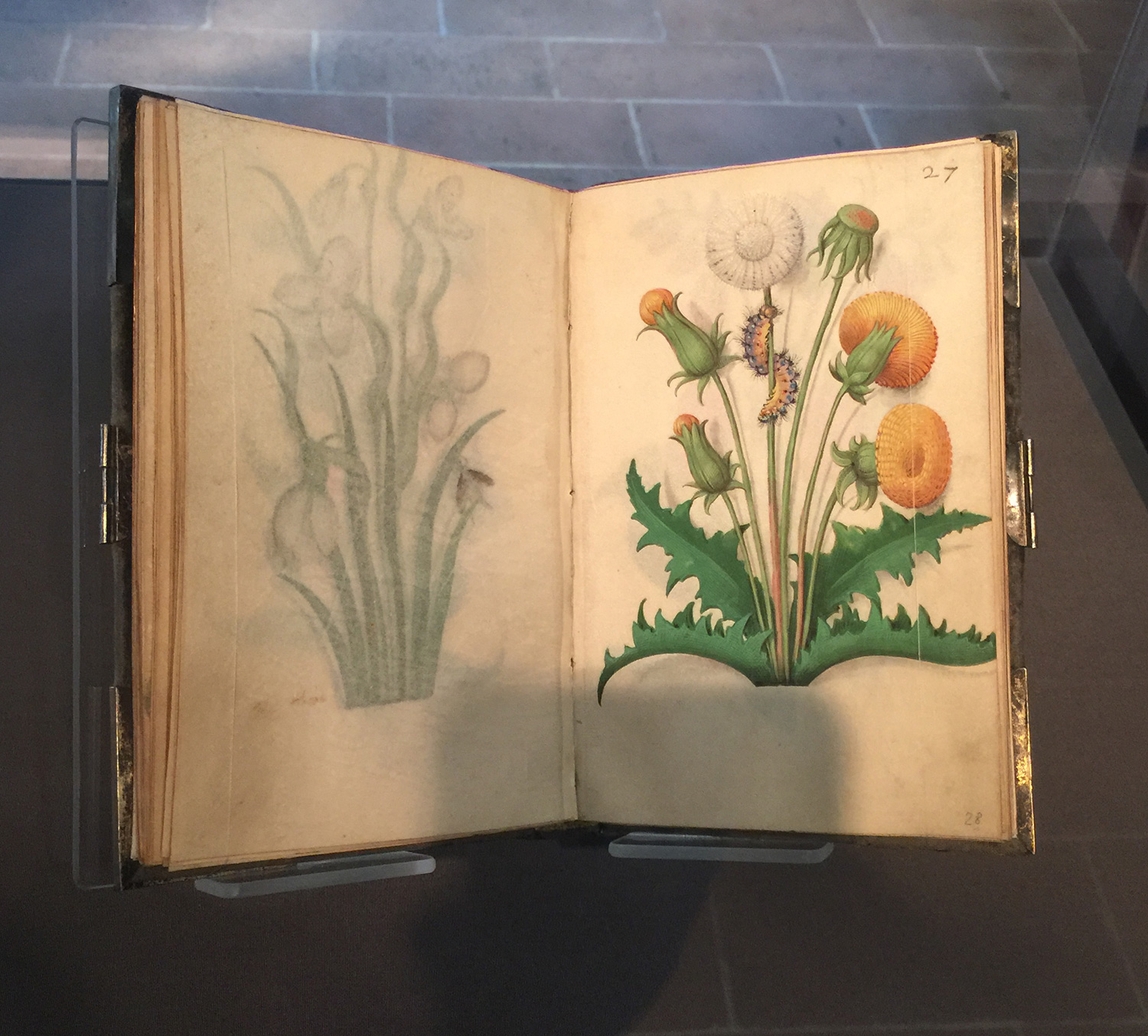
To redeem their art skills there was a drawing on a dandelion in a very small book. The detail work was exquisite.

If you’re in the San Francisco area, go to the Oakland Museum of California. The Burning Man exhibit is long gone but they have great exhibits all the time. And if you’re in the New York area, go to the Cloisters. The gardens are wonderful and the permanent collection is excellent.

Jessica Describes Stuff – NSFW. Basic Instinct.

Wednesday, June 23rd, 2021

While I am in the midst of learning how silicone caulk works (so sticky!), I made a video about the sensual thriller Basic Instinct.

PTAC improvement, Part 2.

Wednesday, June 16th, 2021

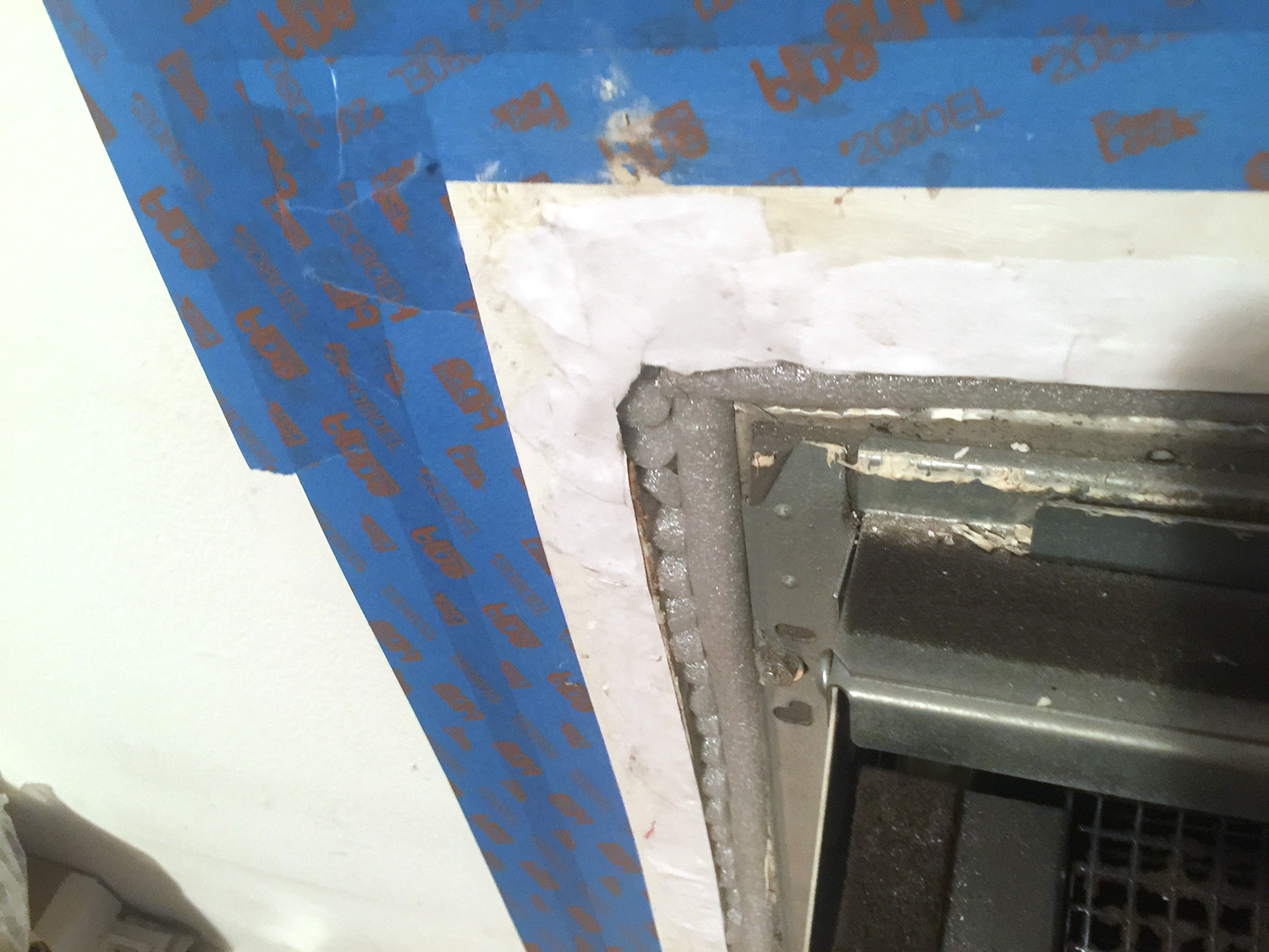
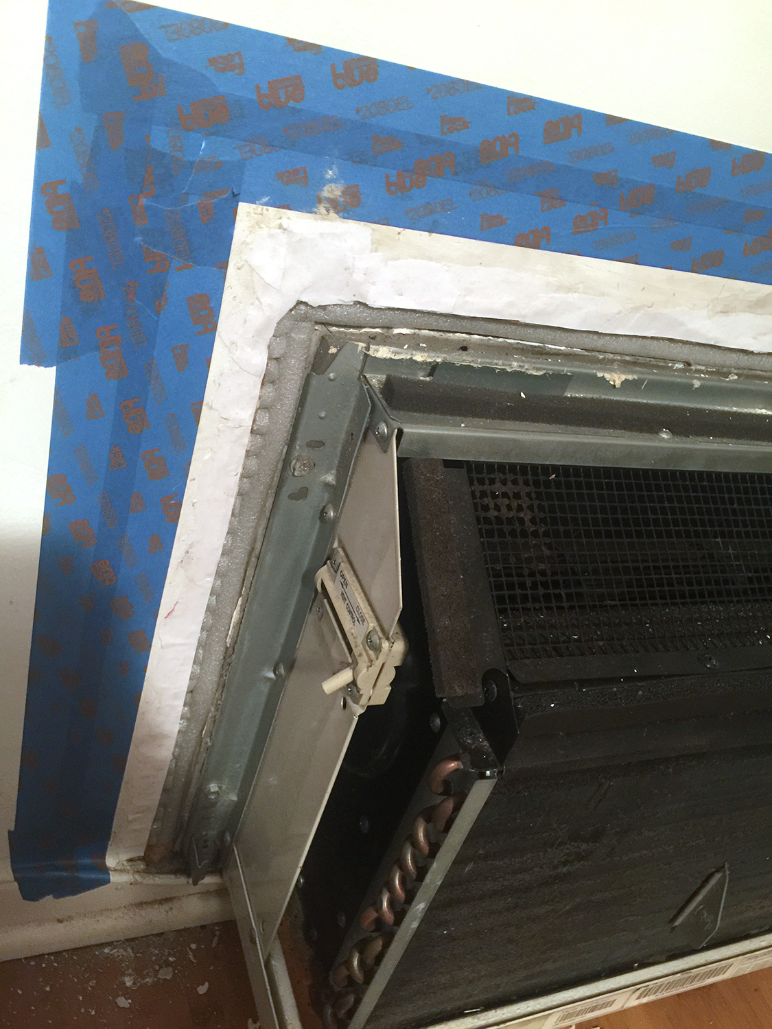
Okay! I went to the local hardware store (support your local hardware store) and got that foam filler as well as white silicone glop. I cut all the foam to fill in all the gaps. Look at that love, that care.

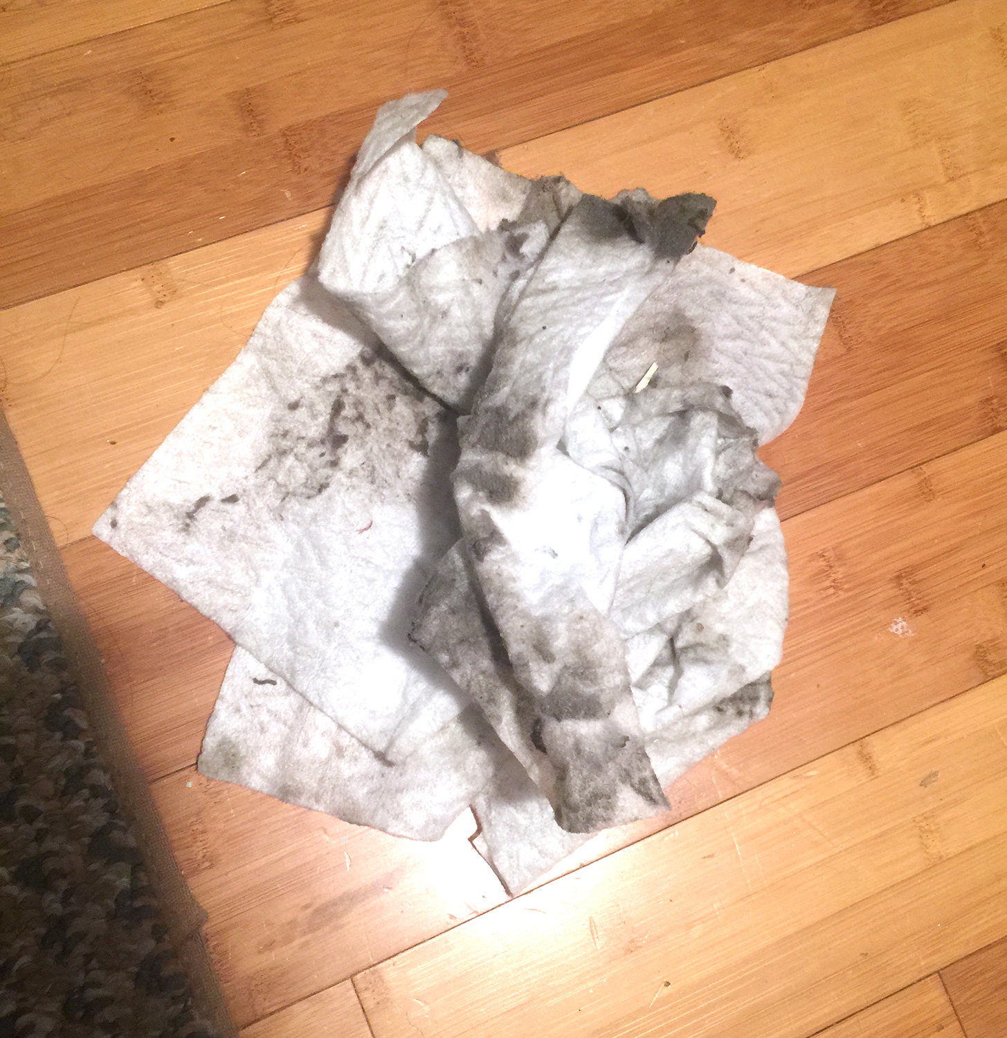
Then I cleaned off the housing and good Lordt, the grime. Look at these swiffers.

Now, because removing the caulk ripped off a lot of layers of wall, I took small bits of paper and put it back with glue so I’ll have a relatively flat surface to spackle on. Remember, we’re not going for flawless, we’re going for not so wretched that it catches your eye.

Next I do a little spackle-y spackle-y, and little sand-y sand-y, a little paint-y paint-y and then the silicone glop. We should be good then.

Artists I am feeling right now.

Sunday, May 16th, 2021

Heather Penn. If you ask me you will learn that I can draw many things, and many things very well, but I can’t draw rocks. Cliffs, piles of rocks, I suck at them. I mean, I can draw them, they just don’t look like rocks. Sometimes they look like pillows, sometimes they look like potatoes, it varies. Therefore I am smitten and not a small bit envious of Heather Penn. Look at her lush artwork. It draws you in.

Heather sells calendars and is starting to get into 3D, I think she’s creating a game studio. https://www.instagram.com/heatpenn/?hl=en


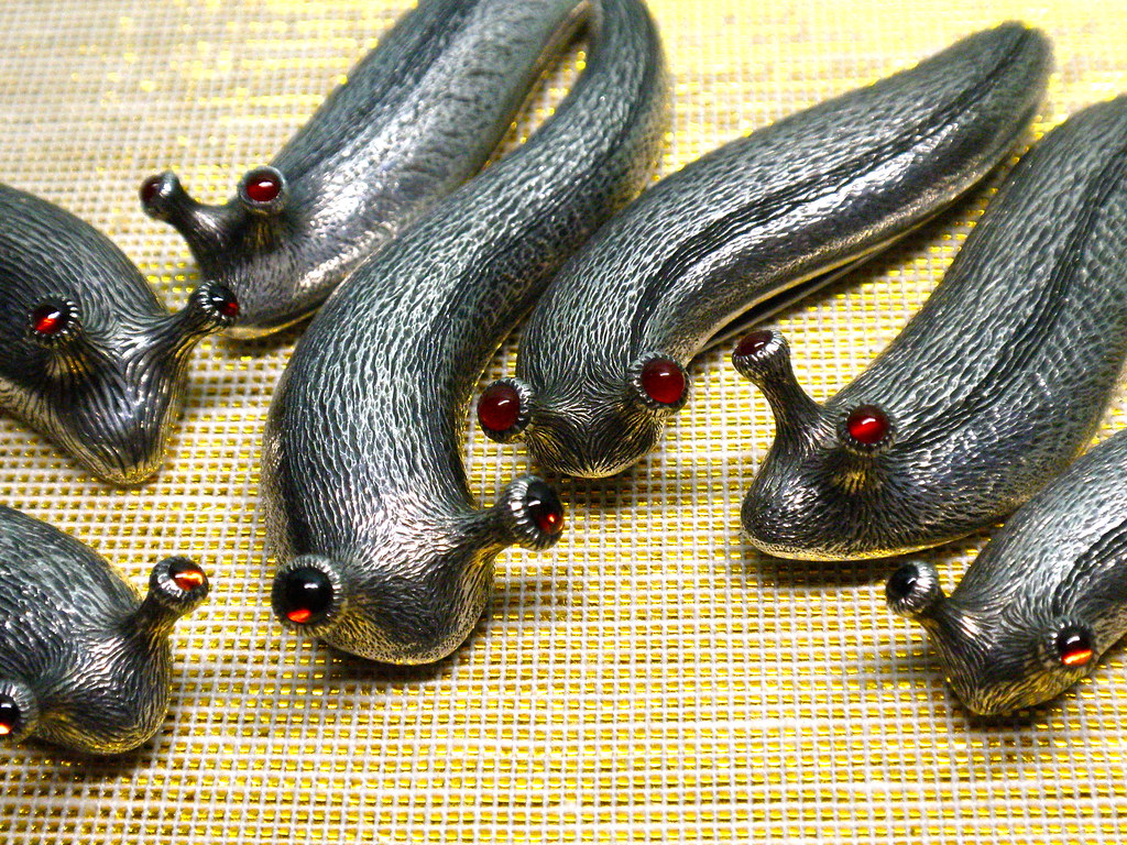
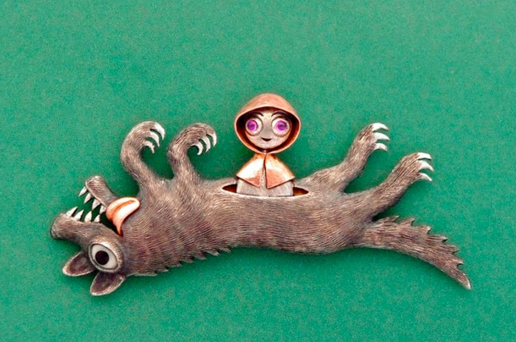
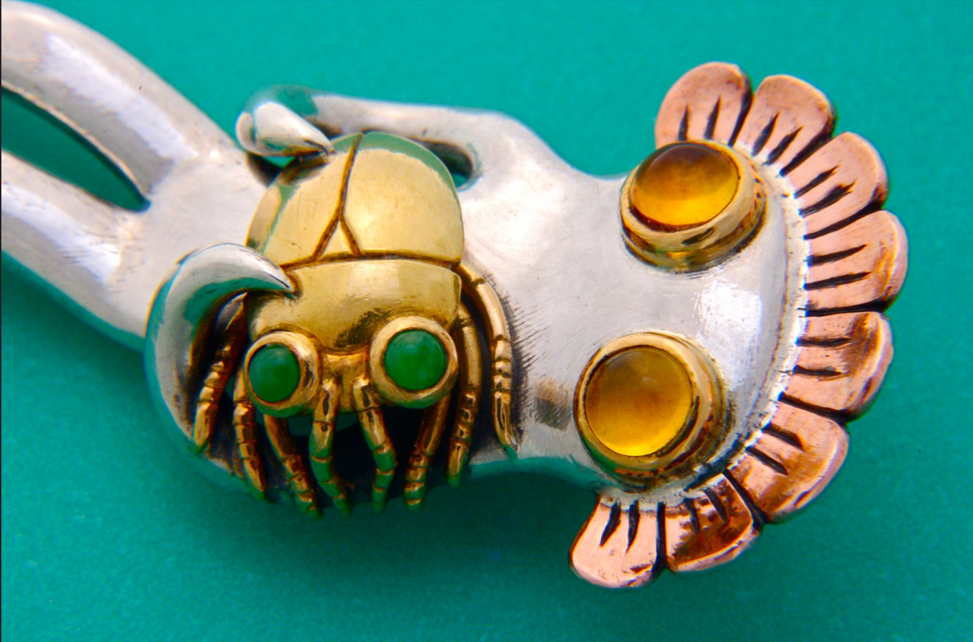
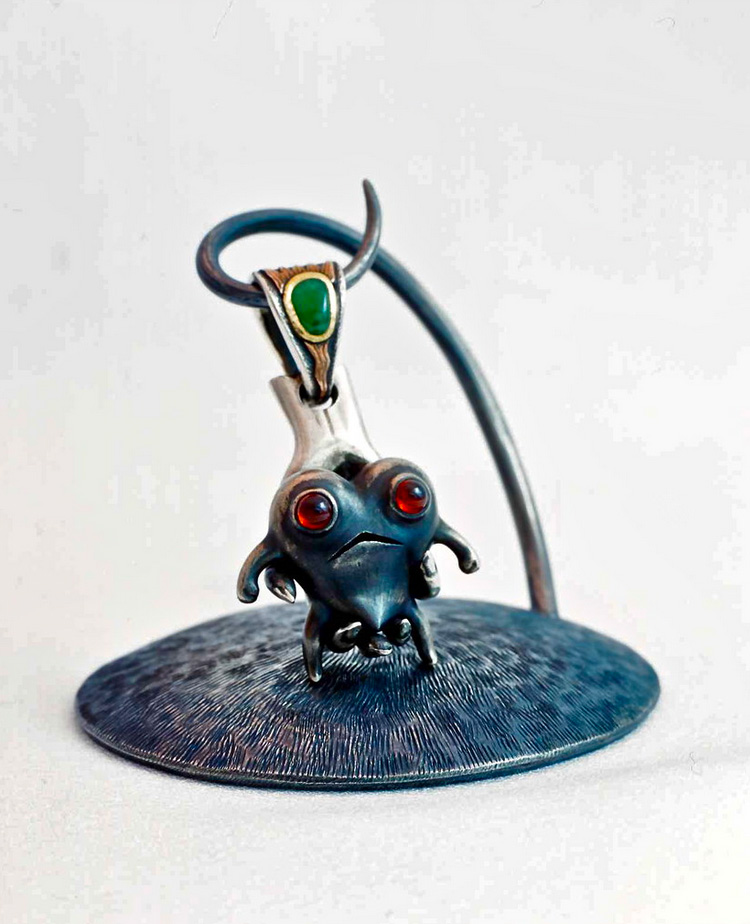
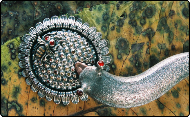
Kazuma Nagai.  I first learned of this Japanese artist when I saw the silver slugs.

I dug a little deeper into his work and he gets weird. I love it.

I don’t where he sells his work but you can follow him on his instagram as well. https://www.instagram.com/slughorse/?hl=en

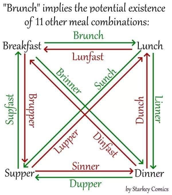
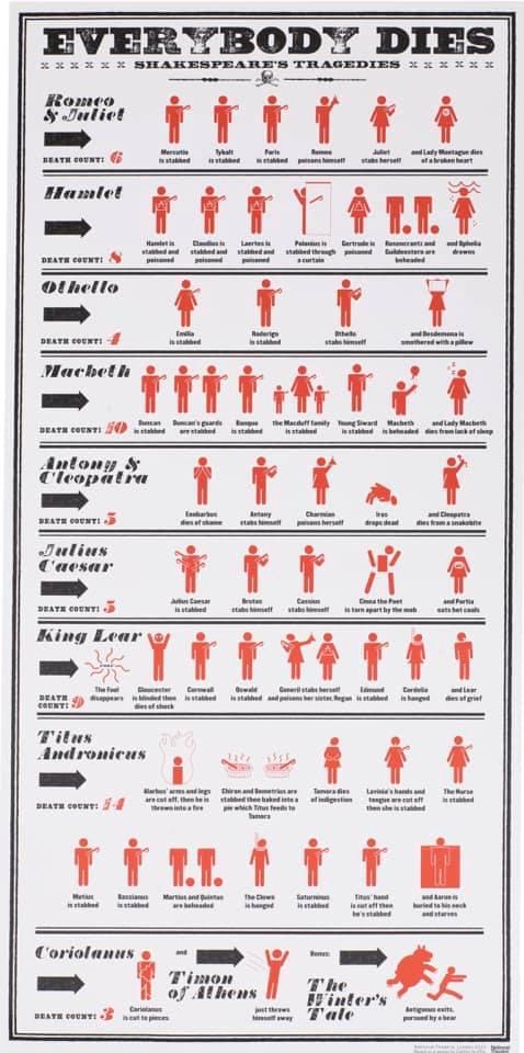
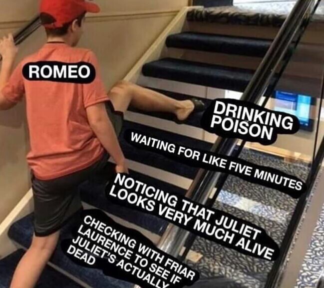
You know what soothes the soul in times of strife? Charts.

Sunday, April 18th, 2021

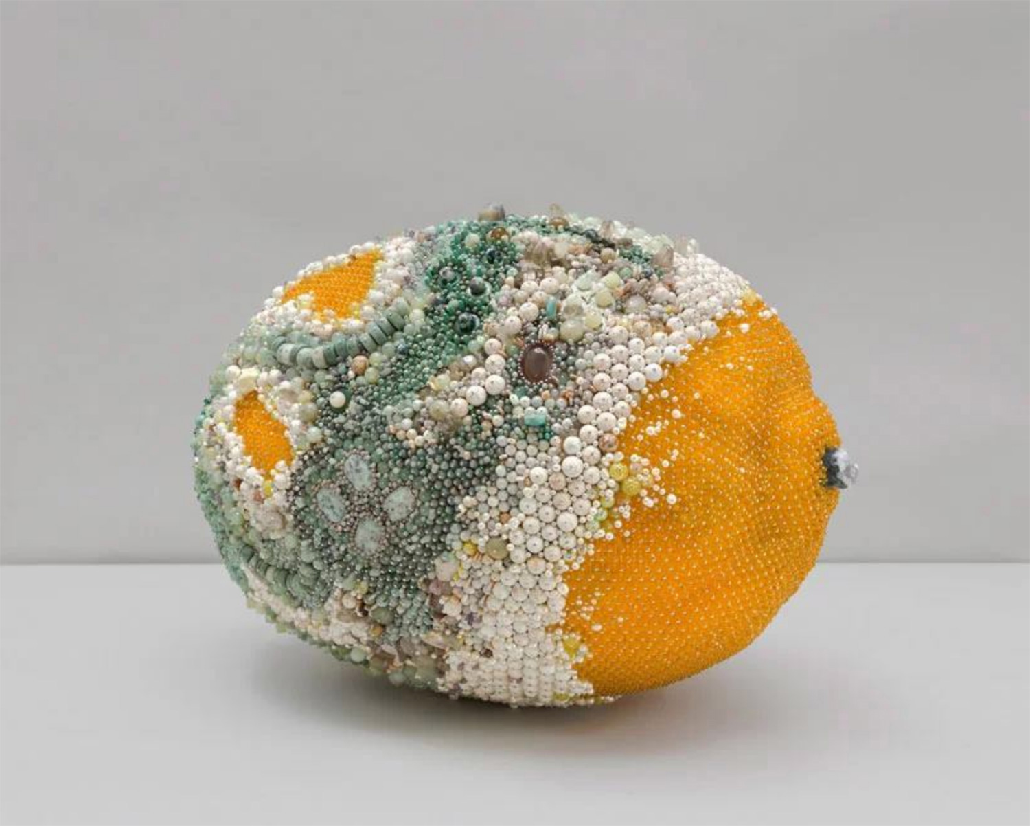
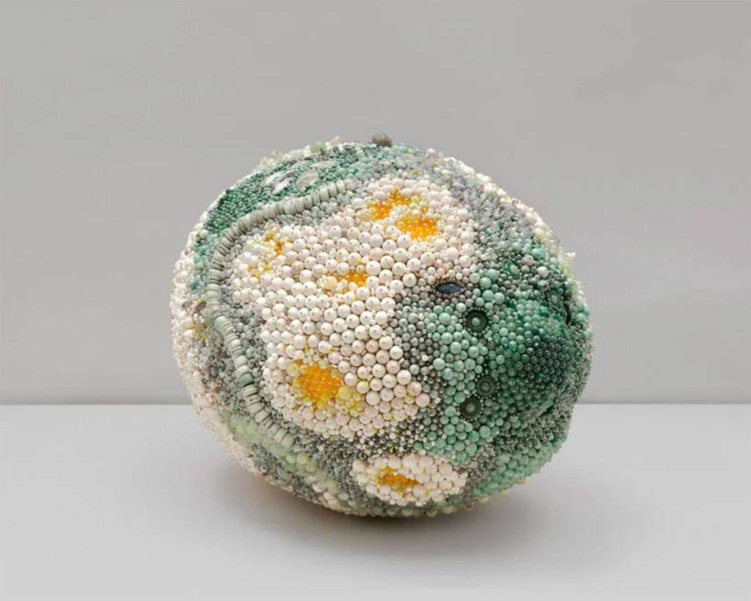
New rotting fruit art!

Tuesday, February 23rd, 2021

I’ve spoken about the amazing work of Kathleen Ryan before. It appears she’s made new fruit and I love them.

I assumed the fruit was larger than life but I had no idea how much larger. It makes me wonder how big her beads are. My beads, even my biggest ones, would not cut it.

Beaver Skull. Here we go.

Tuesday, February 2nd, 2021

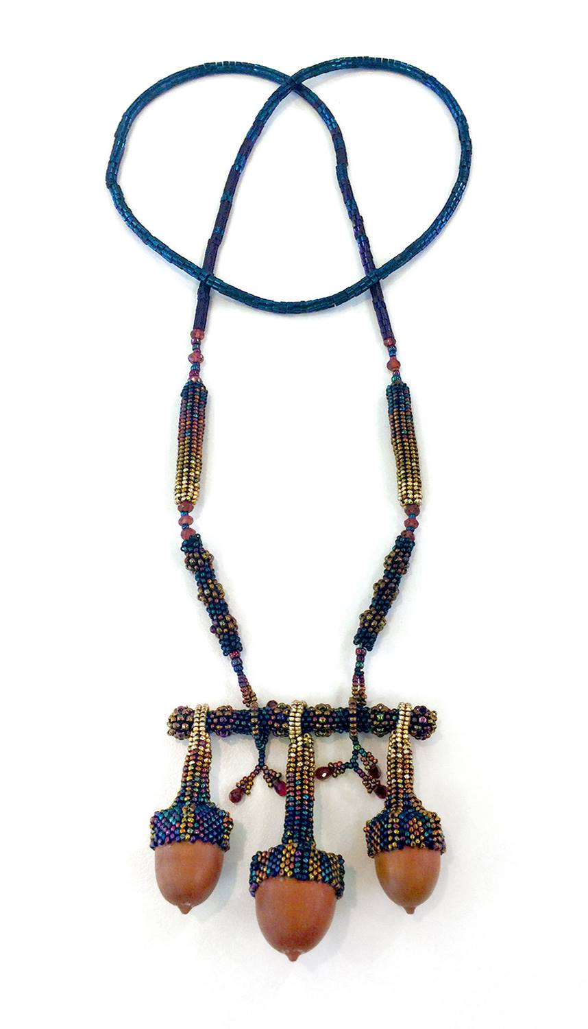
Remember Deer Skull? In a moment of weakness I bought a beaver skull. C’mon guys, it was on sale! I got it for cheaper because the front teeth, the most valuable part of the skull, were broken at the tips. I’m going to cover the whole skull with beads similar to the deer but in gold and jewel tones. I have a lot of beads left over from the acorn necklace.

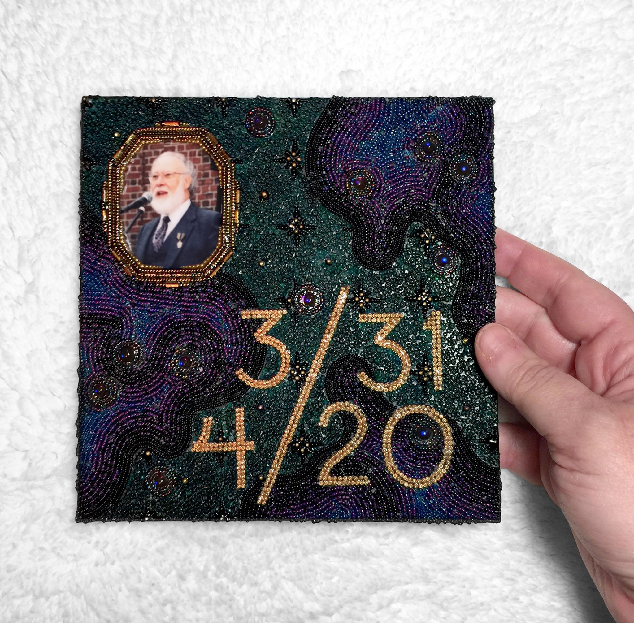
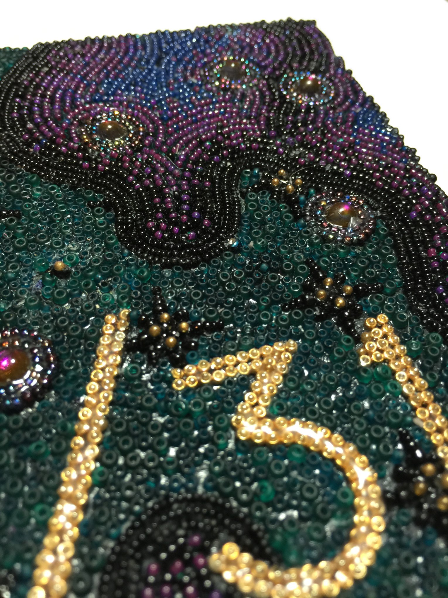
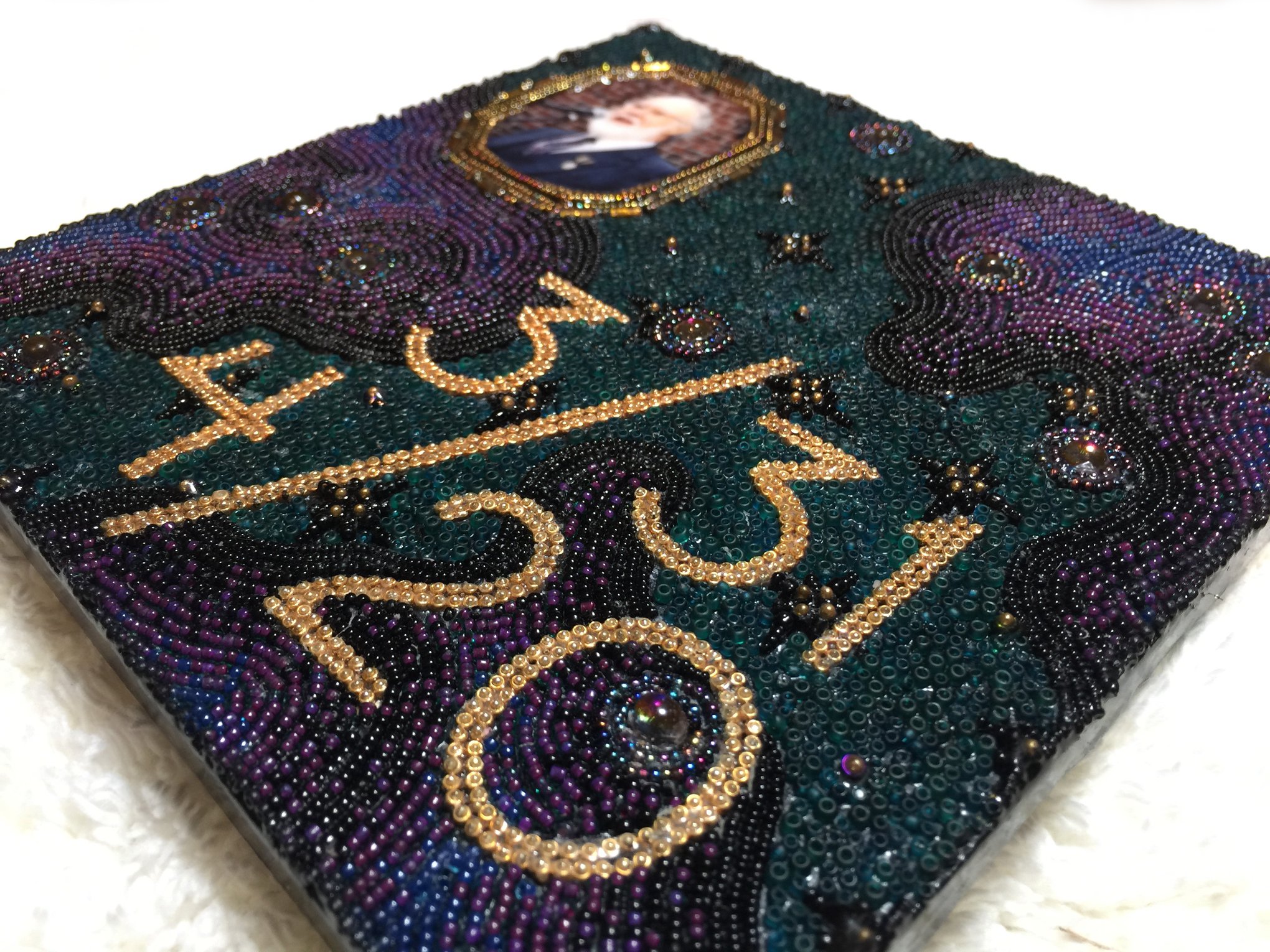
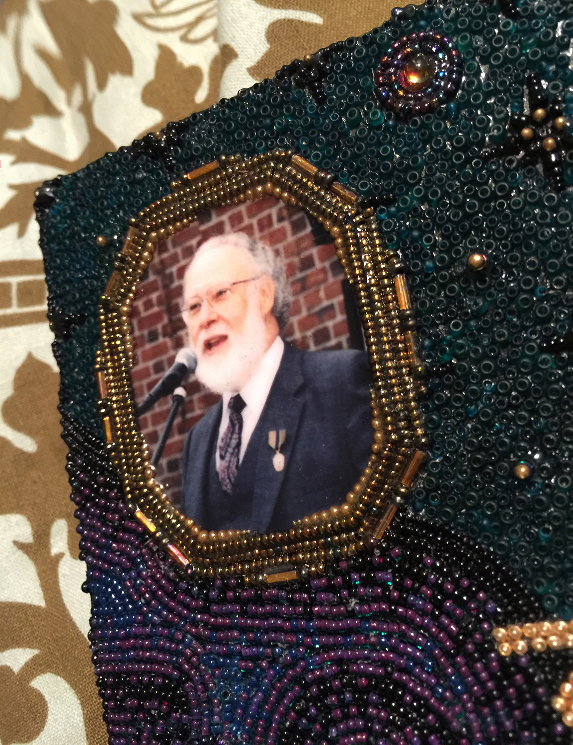
And after my dad died I submitted a 6″ x 6″ tile to the Museum of Beadwork, I used more of those metallic beads there.

So for this skull instead of matching the color of the bone I’m going hard in the opposite direction. I painted the everything except the teeth blue and put blue and green felt on areas where I might want to shove in some decorative pins. I need a substrate to shove the pins into and bone is notoriously resistant.

I used Apoxie Sculpt to mold clean ends on the teeth. I can cover those bits with beads and you’ll never know they were janky and broken. Fun fact: The reason the fronts of the teeth are orange is because that’s rust. Their teeth are covered with iron.

I want there to be a gold line going from the forehead to the back. Lord, this has been a journey. I first beaded a beautiful strip. I couldn’t believe the richness of the gold color. Then I realized the richness is due to the beads being covered in 24K gold. I had forgotten I had bought them. I am very much not using those beads on a frikkin’ beaver skull so I took it apart.

Attempt #2. I decided I wanted it to be a pointed stripe fading into dark blue. The color blend was too chunky so that one was scrapped.

Attempt #3. Nope.

Attempt #4. YES.

I will clip those loose threads and I can fix the wobbliness when I glue it down by pushing it around until it sets.

That took a solid week to make one strip. This learning curve needs to pick up but I’ll get there. Eventually.

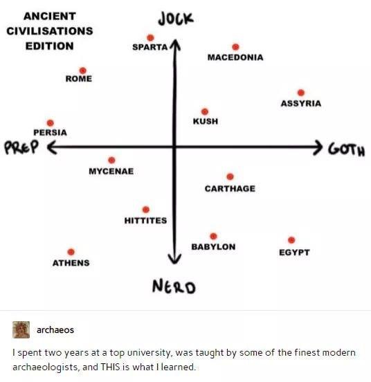
Let’s start the 2021 on the right foot. With charts.

Friday, January 15th, 2021

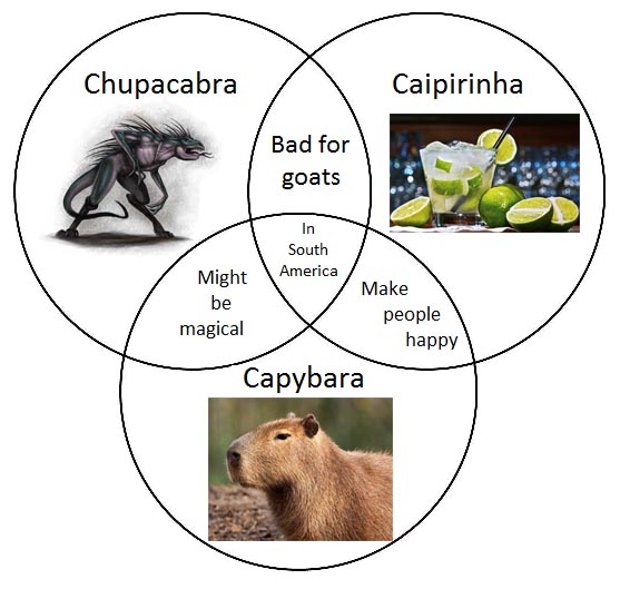
Several of my favorite charts, the Venn Diagram, which pleases me.


And check out this extremely beautiful infographic. I love it.

Art and design. Choices are made. Not all of them are great.

Thursday, January 7th, 2021

Design is my career so I unintentionally look at everything and check spacing, check colors, check legibility, check line breaks, etc. It’s maybe not the best trait because I can’t ignore bad art and design which is all over the place. Allow me to share.

Swishy brush fonts are tough. Too much swishy and it looks like a different letter. And sometimes the swishies between two letters touch and you get problems. Let’s not forget the “Clint” nametag incident. “Curt” isn’t workin’ too good either.

Back when we could go places I used to frequent a Korean takeout place. This was the packaging for their chopsticks.

I thought it said OW! for way too long.

Good To Go! A lovely cafe in White Plains where I live. Look at how the tree is nestled between the D and the T. That works.

So why is your overhang this? Why? With the tree as the T? Which is a similar brown to the sign so you can’t see it? It you made the tree white it might have been fine. Please get ladder and fix. Please. It hurts my heart.

I used to pass this in Grand Central Terminal every day.

Perfect. Papyrus, now with the addition of Comic Sans. It’s circled back around to glorious.

And finally…

Everything. Everything is wrong with this. And I had to stare directly at it when I went to the bathroom. Truly blessed.


Addendum: I love how each animal gets crappier as your eye slides down the painting.